Jenine Marquez
Product Designer
North State Pizza is a family-owned pizza restaurant in Briarcliff Manor, New York. They pride themselves on their fresh ingredients and offer free delivery.
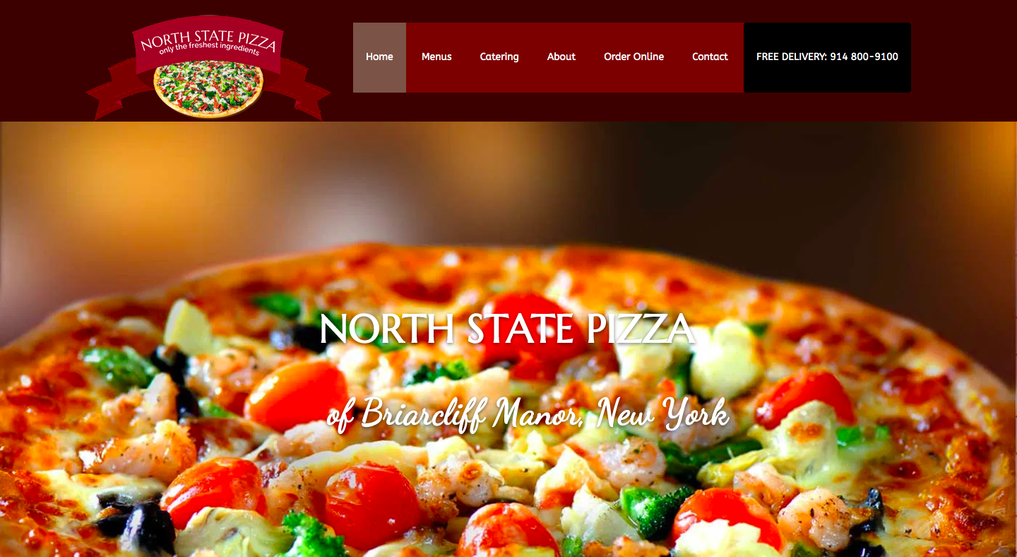
Click on image to visit current website
The current North State Pizza website isn’t very responsive, is cluttered with more webpages than needed, and could use a facelift in the colors, typography, and imagery used. We want to avoid confusing or overwhelming the potential customer with information.
Design Objectives
Give people information about the restaurant (menu, location, hours)
Show restaurant menus (both regular and catering)
Encourage online ordering through the website, either by phone or online
Research and Inspiration
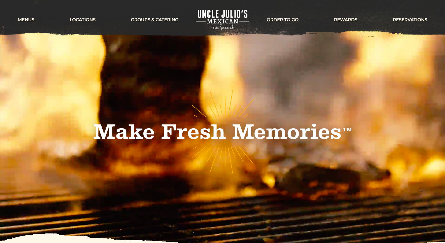
Click to view website
Uncle Julio’s
Standout Elements
Video on landing page with headline
Bright color palette (yellow, green, browns)
Brush stroke dividers
Vintage-style food illustrations
Clear and modern typography
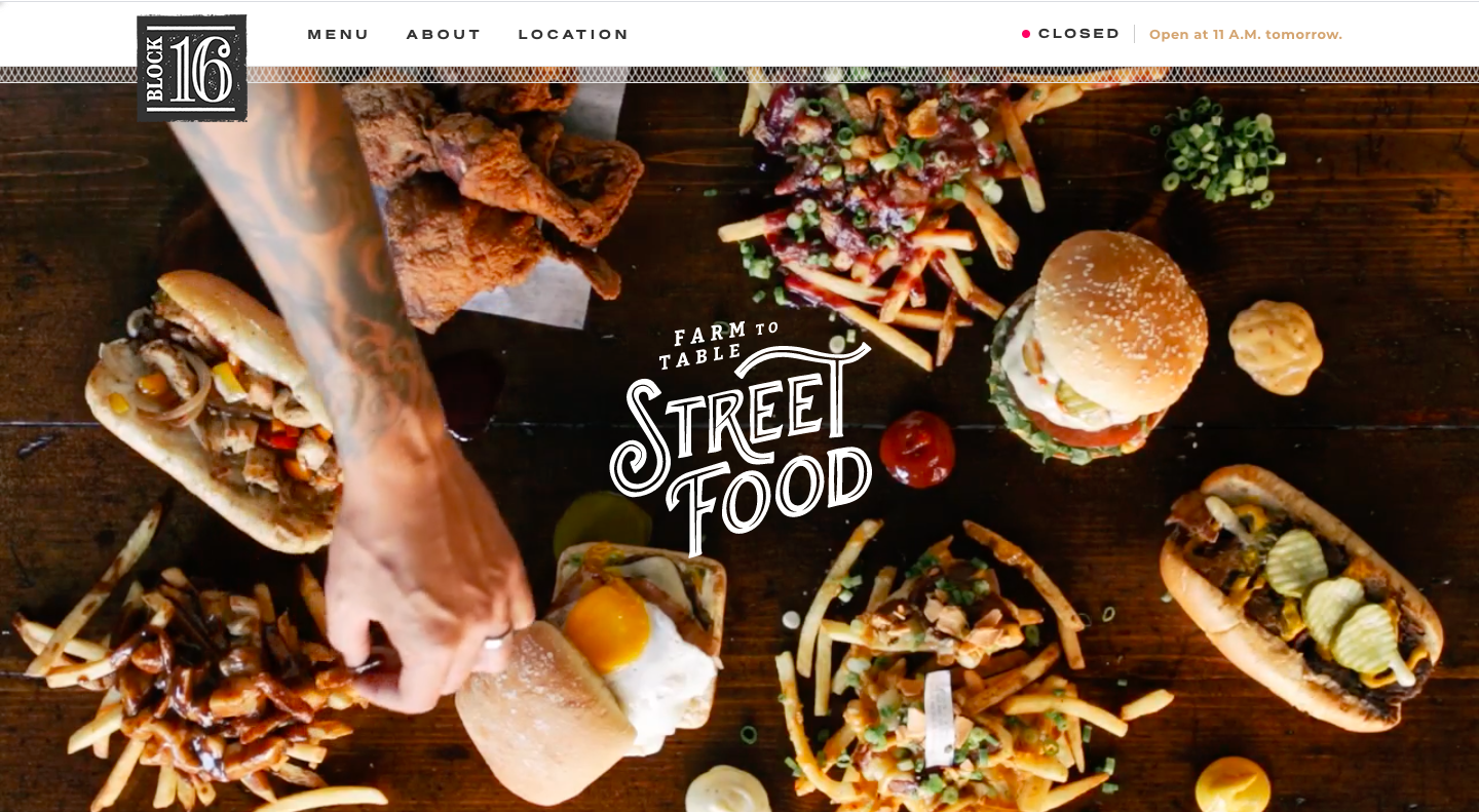
Click to view website
Block 16
Standout Elements
Good mix of clean/modern with some grit (Street Food lettering, grunge texture on logo)
Vintage-style illustrations with text overlays
Menu page mimics layout of print menu, includes icons
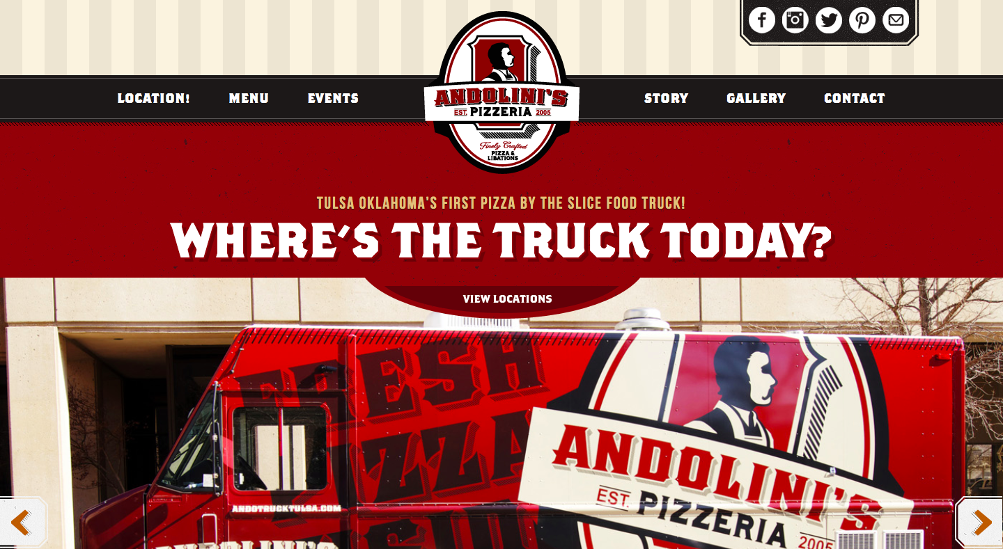
Click to view website
Andolini’s Pizzeria Food Truck
Standout Elements
Mixes traditional Italian restaurant elements with more modern colors and typography
Responsive menu design
Rustic paper textures
Contact section with email form, newsletter sign-up form and social media links
Reorganization
The Brand
Typography

Since North State Pizza is a traditional Italian restaurant, I used slab-serifs and serifs to convey the classic feel of the restaurant. For the body copy, I chose the legible and friendly Open Sans.
Colors
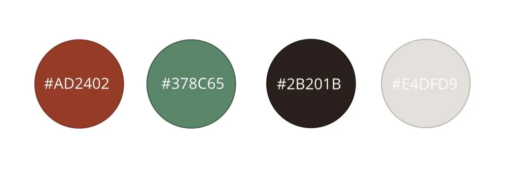
The color palette is an updated take on the classic Italian restaurant colors, with muted versions of the Italian flag colors. For the neutrals, I used a dark toasted brown and a doughy off-white.
Mood Board
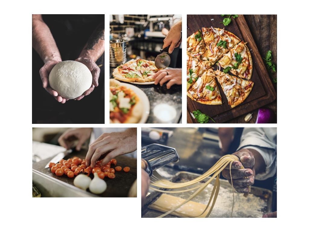
For the imagery, I wanted to convey the authenticity and action of the pizza-making process, since the restaurant uses fresh ingredients for its pizzas. I included many pictures of hands to emphasize the handmade quality of the food.
The Website
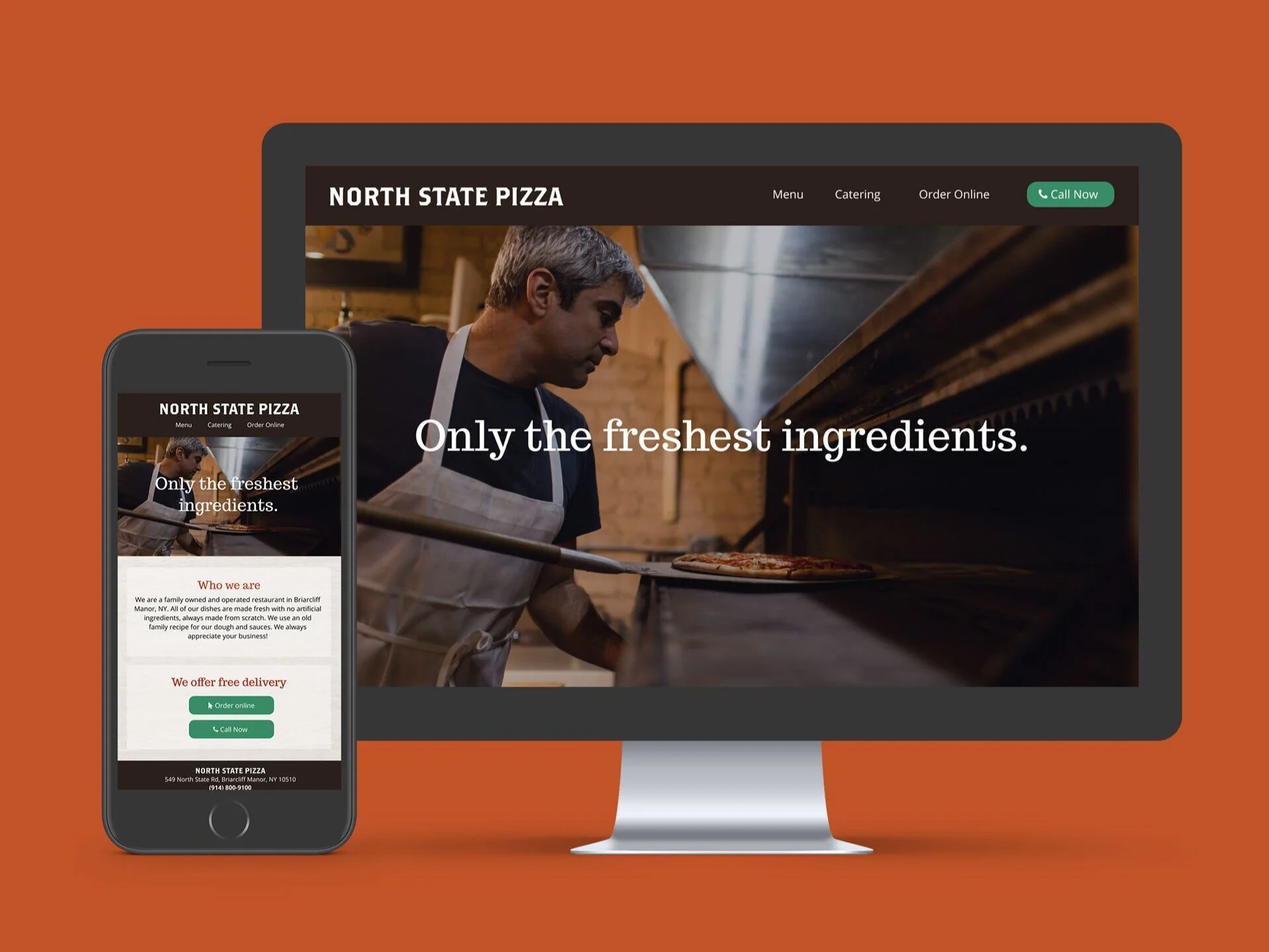
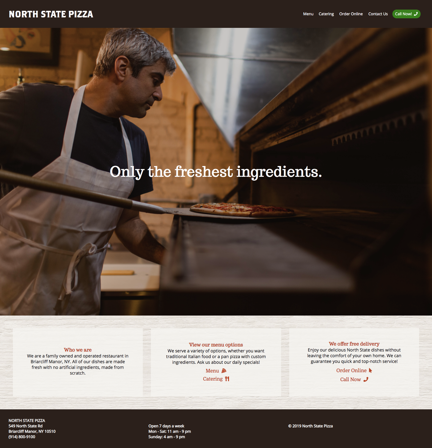
Homepage
On the homepage, I divided all the relevant links and information into three columns. I moved the short About page onto one of these columns, to give the user a brief introduction to the restaurant as they look at the website for the first time. The other two columns are Menu Options (which includes links for the regular menu and catering menu pages) and Free Delivery (which gives the user two ways to order their food).
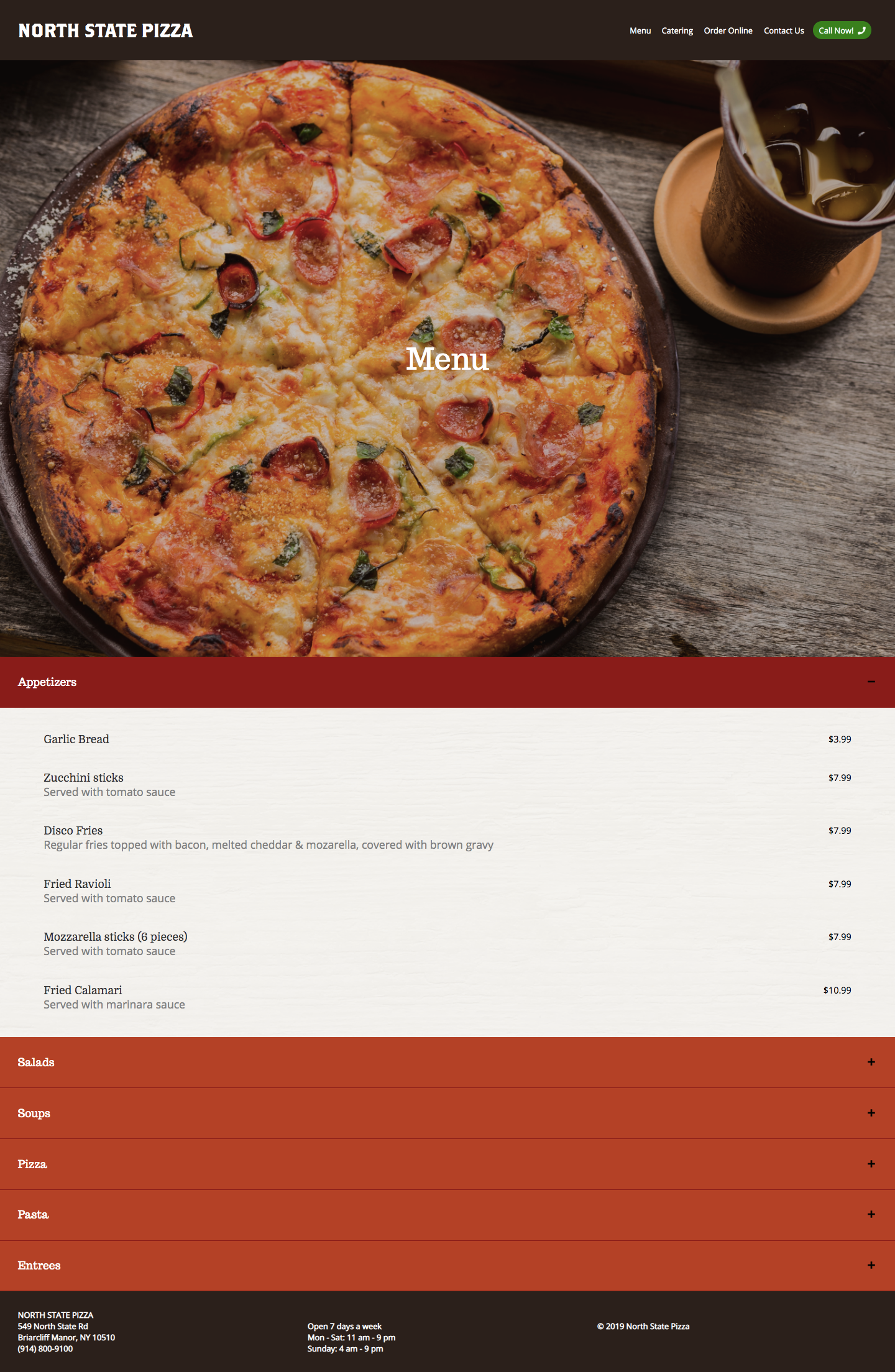
Menu
For the menu page, I wanted to include all the menu options without the user having to scroll endlessly to find what they’re looking for. Therefore, I added an accordion menu, so that when the user clicks on a category block, they can see the menu items within that category. When the user clicks on the category block again, the menu section will become hidden again.
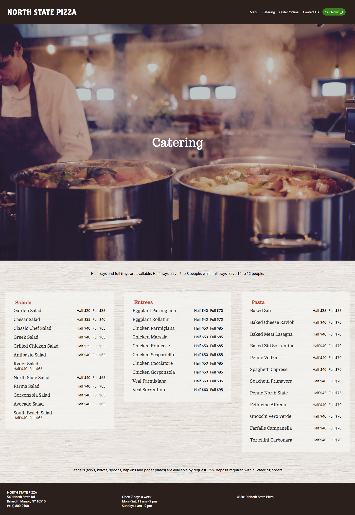
Catering
All the items on the catering menu fell into three categories, so I split the page into three columns just like the homepage. On the top, I included an explanation of half trays and full trays, and added disclaimers at the bottom.
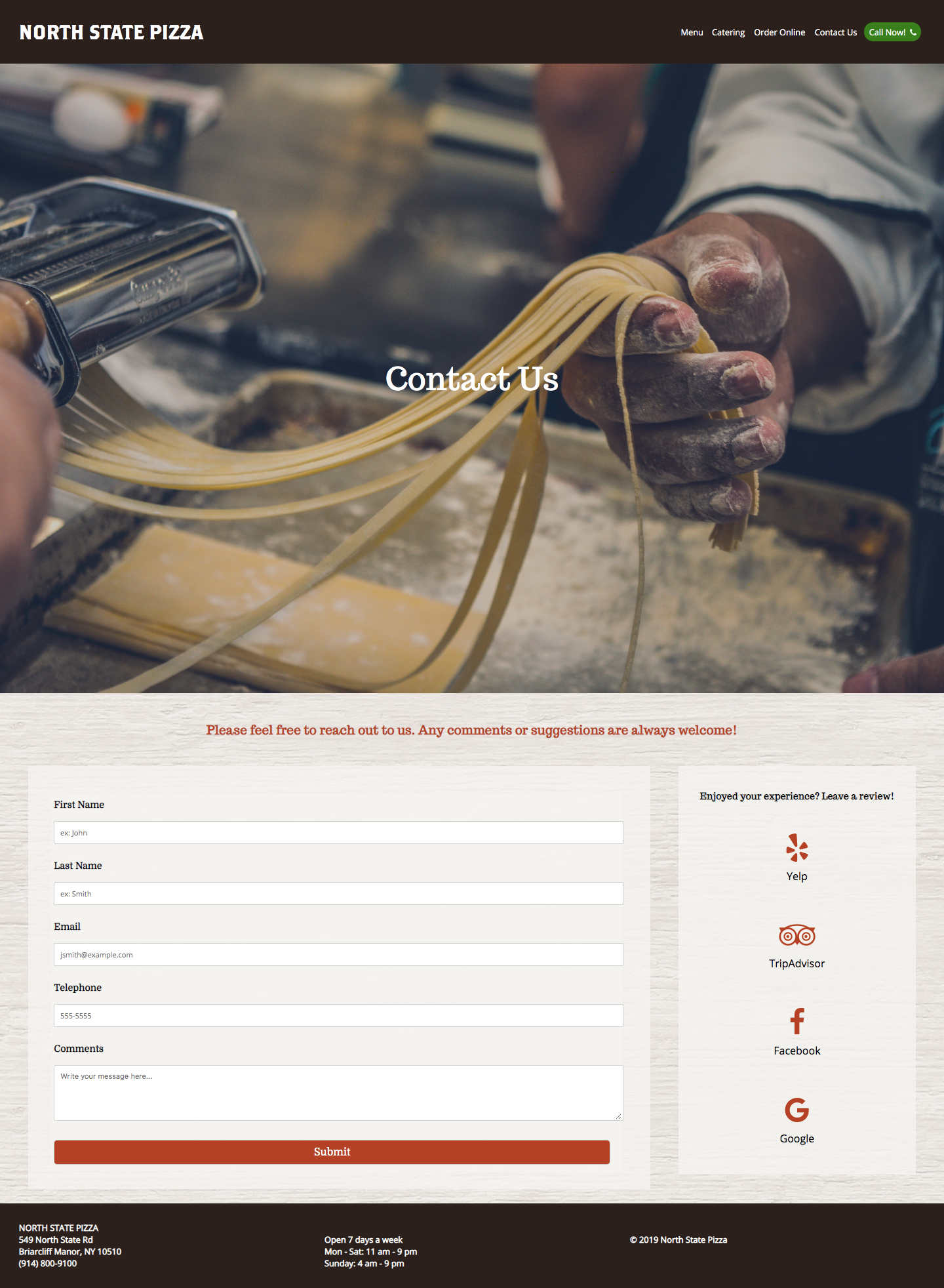
Contact Us
The contact page is split into two sections: the contact form and a block with a list of review pages (Yelp, TripAdvisor, Facebook, and Google). Since many people who visit the contact page want to give feedback, we want to redirect those people to review sites so that they can share their thoughts with others online.